
- By Ayo Binitie
When the mind fractures, colour speaks. Contemporary African artists are redefining how we understand the relationship between visual art, colour psychology, and mental health—moving beyond Western frameworks to explore how cultural context, personal history, and chromatic intensity intersect during moments of psychological crisis. Nigerian diaspora artists aYo Binitie, Nsikak Essien (deceased), and Osi Audu offer particularly compelling explorations of how colour can either ignite or calm the brain during mental breakdown, each bringing distinct approaches that challenge conventional understandings of art therapy and neurological response.
Ayo Binitie: Fragmenting Identity Through Chromatic Agitation
The Neurochemistry of colour Perception in Cultural Context
The human brain processes colour through a complex cascade involving the retina, the thalamus, and ultimately the visual cortex in the occipital lobe, but colour perception doesn’t stop at visual processing. The limbic system—our emotional control centre—becomes immediately involved, triggering responses in the amygdala and hippocampus. During periods of mental breakdown, when neural regulation is already compromised, these colour-triggered responses can become dramatically amplified.
Yet recent neuroscience research reveals that colour perception isn’t purely biological—it’s also culturally conditioned. The meanings we assign to colours, the emotional associations we carry, and even the physiological responses we experience are shaped by cultural context. For African artists working within and between multiple cultural frameworks, this creates unique opportunities to explore how colour affects psychological states.
Warm colours—reds, oranges, and yellows—stimulate the sympathetic nervous system, increasing heart rate, blood pressure, and cortisol production. For someone experiencing acute anxiety, panic, or manic episodes, exposure to these colours can function like psychological accelerant. Cool colours—blues, greens, and purples—engage the parasympathetic nervous system, promoting serotonin release and reducing cortical arousal.
But the story is more complex than simple temperature metaphors suggest, as the work of Binitie, Essien, and Audu demonstrates.
Ayo Binitie: Fragmenting Identity Through Chromatic Agitation
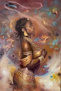
aYo Binitie’s powerful figurative
paintings confront viewers with rich colour relationships that mirror the experience of psychological disintegration. His work steeped in mythologydoesn’t simply depict mental anguish—it replicates the perceptual chaos of a mind in crisis through aggressive chromatic clashes and anatomical fragmentation.
In Binitie’s portraits, flesh tones while seeming so, are rarely naturalistic. Instead, faces emerge in heated and muted pinks, greens, purples, and oxidized oranges—colours that create visual dissonance and neurological unease with a strange calm. These aren’t arbitrary choices. When the brain encounters unexpected colour combinations, particularly in human faces where we have hardwired expectations, it experiences a moment of cognitive disruption. The visual cortex struggles to reconcile what it expects to see (natural skin tones, unified facial features) with what it actually sees (chromatic chaos, fragmented identity).
This disruption mimics the experience of dissociation and identity fragmentation during severe mental health episodes. Binitie’s figures often appear to be simultaneously coming together and falling apart—body parts rendered in different colour temperatures, faces split between cool and warm zones, creating a visual representation of the mind’s inability to maintain coherent self-perception during breakdown.
His use of deep ceruleans, pinks, greens and burnt oranges against deep blacks and muddy browns creates maximum chromatic tension. The brain’s visual processing system must work harder to make sense of these relationships, creating measurable increases in neural activity. For a viewer with intact mental health, this can be exciting, energizing, even cathartic. For someone experiencing acute psychological distress, Binitie’s colour relationships can feel overwhelming—a visual amplification of internal chaos.
Yet there’s also something validating about seeing one’s internal fragmentation reflected externally. Binitie’s paintings don’t offer comfort through soothing colours or harmonious compositions. Instead, they offer recognition: this is what breakdown looks like, feels like, perceives reality like. The violent colour clashes aren’t decoration—they’re documentation of the brain under siege.
Nsikak Essien: The Uncanny Valley of Chromatic Displacement
Nsikak Essien’s figurative paintings operate in a different register of psychological tension. His subjects—often rendered in hyperrealistic detail from the neck down while maintaining slightly stylized, mask-like faces—exist in chromatic environments that feel subtly wrong, creating what might be called the “uncanny valley” of colour relationships.
Essien frequently places his figures against backgrounds of unexpected colours—lime greens, artificial blues, flat pinks—that don’t correspond to natural environments. This chromatic displacement creates cognitive dissonance: the figures are rendered with such technical precision that the brain reads them as “real,” but the colour context screams “artificial.” This contradiction between rendering style and chromatic choice mirrors the experience of derealization—a dissociative symptom where the world feels unreal, dreamlike, or artificial despite appearing visually normal.
The psychological impact of this approach is subtle but profound. Unlike Binitie’s aggressive fragmentation, Essien’s colour choices create a quieter form of unease. The brain constantly tries to resolve the contradiction between the realistic figure and the impossible colour environment, creating low-level cognitive stress that never quite resolves. This matches the exhausting mental work of maintaining functionality during depression or anxiety—the constant effort to reconcile internal experience with external presentation.
Nsikak Essien: The Uncanny Valley of Chromatic Displacement
Essien’s palette often trends toward the cooler end of the spectrum—blues, teals, muted purples—but deployed in ways that prevent them from offering neurological calm. A mint green background should theoretically soothe, but when it’s flat, artificial, and unmodulated, it becomes alienating rather than calming. The brain receives the wavelengths of cool colours but without the natural variations (shadows, highlights, atmospheric perspective) that typically make cool colours restful.
This represents a sophisticated understanding of how colour affects mental states: it’s not just the hue that matters, but how it’s deployed, what context it appears in, and how it relates to the subject matter. Essien’s figures often appear isolated within these chromatic environments—psychologically alone despite technical perfection. The colours don’t cage them through warmth and aggression; they isolate them through coolness and artificiality.
For someone experiencing depression’s emotional numbness, Essien’s paintings offer a precise visual metaphor: technically present, perfectly rendered, fundamentally disconnected. The cool colours don’t calm because they don’t soothe—they reinforce the distance between self and world that characterizes depressive disorders.
Osi Audu: Kinetic colour and the Racing Mind
Osi Audu’s
approach to colour and mental states operates through movement, pattern, and chromatic intensity that borders on visual vibration. His works—whether paintings, installations, or mixed media pieces—often feature bold patterns, repetitive motifs, and colour combinations that create optical effects, forcing the eye to constantly readjust and refocus.
Audu’s use of high-contrast colour relationships—bright yellows against deep blacks, electric blues against oranges, reds against greens—creates chromatic vibration. This isn’t a metaphor but a literal perceptual phenomenon: when complementary colours of similar intensity sit next to each other, the edge between them appears to shimmer and move. The visual cortex struggles to process both colours simultaneously, creating a sensation of motion even in static images.
Osi Audu: Kinetic colour and the Racing Mind
For a brain experiencing mania, racing thoughts, or anxiety, Audu’s kinetic colour relationships mirror internal experience. The inability to settle, to find rest, to stop moving—these psychological states find visual expression in colours that won’t sit still. The eye wants to look away but is drawn back by the intensity. The brain seeks a resting point but finds none. This is what anxiety looks like in colour: constant motion, unresolvable tension, exhausting vigilance.
Yet Audu’s work also demonstrates how pattern can provide structure within chromatic chaos. Many of his pieces feature geometric repetitions—circles, lines, grids—that create predictable rhythms even while the colours clash and vibrate. This combination of chromatic intensity and structural predictability offers an interesting model for understanding how creative practice might help regulate disturbed mental states.
The patterns give the brain something to organize around, a structure to impose on chromatic chaos. This mirrors certain therapeutic approaches to managing racing thoughts or obsessive thinking—not eliminating the intensity but channeling it into structured patterns. Audu’s work suggests that excitation isn’t always destructive; when combined with structure, high-arousal colour combinations might provide an outlet for mental energy rather than simply amplifying distress.
His installations often immerse viewers in colour environments, surrounding them with the patterns and hues that might appear on canvas. This total immersion creates a controlled experience of being overwhelmed—you can choose to enter, to stay, to leave. For someone whose internal experience feels out of control, this agency within intensity can be paradoxically calming. The artwork says: chaos can be contained, pattern can exist within intensity, you can experience excitation without disintegration.
Cultural Context: colour Meanings in Mental Health
What makes the work of Binitie, Essien, and Audu particularly significant for understanding colour and mental health is their navigation of multiple cultural frameworks for understanding both art and psychological distress. In many African contexts, mental illness carries different stigmas, explanations, and meanings than in Western psychiatric frameworks. colour symbolism also varies significantly across cultures.
Binitie’s chromatic violence speaks to the particular experience of navigating identity fragmentation across cultures—the Nigerian diaspora experience of being simultaneously multiple selves, multiple identities, none fully integrated. His colour choices reflect this cultural complexity: they’re not simply Western colour theory applied to African subjects, but rather a hybrid chromatic language that draws from multiple traditions.
Essien’s chromatic displacement engages with questions of representation and authenticity—his subjects exist in colour spaces that refuse easy categorization, neither “African” nor “Western” in their chromatic logic. This ambiguity mirrors the psychological complexity of existing between cultural frameworks, where depression or anxiety might be understood through multiple, sometimes contradictory lenses.
Audu’s kinetic colour work draws from both traditional African textile patterns and contemporary op-art, creating visual experiences that acknowledge multiple cultural lineages. His approach suggests that psychological intensity—the racing thoughts, the heightened perception—might be channeled through cultural forms that have historically used pattern and colour for spiritual, social, and psychological purposes.
The Therapeutic Paradox: When Excitement Heals
Traditional colour therapy often follows simple prescriptions: cool colours for anxiety, warm colours for depression, green for balance. But the work of these three artists suggests a more complex relationship between chromatic intensity and psychological wellbeing.
Sometimes, excitation is exactly what’s needed. Binitie’s violent colour clashes might overwhelm an anxious viewer but could energize someone experiencing depression’s numbness. The aggressive pinks and oranges demand emotional response, refusing to allow the detached observation that depression makes possible.
Similarly, Essien’s cool but unsettling colour environments might exacerbate feelings of unreality in someone experiencing active dissociation, but could provide validation and recognition for someone recovering from such episodes. There’s power in seeing one’s psychological experience reflected accurately rather than soothed dishonestly.
Audu’s kinetic colour work might seem contraindicated for anxious or manic viewers, but could provide much-needed structure and outlet for mental energy seeking expression. The pattern within the chaos suggests that intensity doesn’t equal disorder—high arousal can be organized, channeled, even beautiful.
This challenges the pharmaceutical model of mental health treatment, which often focuses solely on reduction: reduce anxiety, reduce mania, reduce intensity. These artists suggest an alternative: transform intensity, structure chaos, express rather than suppress.
The Social Dimension: colour, Community, and Collective Healing
One aspect often overlooked in Western discussions of art and mental health is the social dimension. All three artists create work that demands to be discussed, that generates conversation, that brings people together in shared perceptual experience.
In many African cultural contexts, mental health is understood not as individual pathology but as relational rupture—disconnection from community, family, spiritual frameworks. The intense, challenging colour work of Binitie, Essien, and Audu creates opportunities for collective experience and shared meaning-making.
When viewers gather before Binitie’s fragmented figures, they discuss what they see, how it makes them feel, what it reminds them of. This conversation itself becomes therapeutic—the isolation of mental illness momentarily broken by shared engagement with challenging art. The violent colours that might overwhelm an individual become bearable, even exciting, within a community of viewers.
Essien’s chromatic uncanniness generates productive confusion—viewers compare their perceptions, validate each other’s unease, collectively work to articulate what feels wrong about the colour relationships. This collective sense-making mirrors the therapeutic value of group support, where individual experiences of distress are validated and contextualized through shared discussion.
Audu’s immersive installations often involve multiple viewers simultaneously, creating shared experiences of chromatic intensity. The kinetic colours that might trigger anxiety in isolation become exciting when experienced collectively. The presence of others provides grounding—a reminder that the intensity is contained within the artwork, not spilling into uncontrolled reality.
Practical Applications: Learning from Contemporary African Artists
What can mental health practitioners and art therapists learn from the colour strategies employed by Binitie, Essien, and Audu?
First, that matching colour to symptom isn’t always therapeutic. Sometimes, intensifying the experience through aggressive colour relationships helps externalize and process internal chaos rather than simply soothing it away.
Second, that cultural context profoundly shapes how colour affects psychological states. colour therapy protocols developed in Western contexts may not translate effectively across cultures. The symbolic meanings, emotional associations, and even physiological responses to colour are partially learned and culturally specific.
Third, that structure within intensity—pattern within chromatic chaos—may be more therapeutic than simple calm. Audu’s work particularly demonstrates how high-arousal colour combinations can be organized through repetition and pattern, providing both excitement and containment.
Fourth, that artistic ambiguity and contradiction—Essien’s chromatic displacement, Binitie’s fragmentation—can build psychological flexibility and tolerance for complexity. Mental health isn’t always about resolution and calm; sometimes it’s about learning to function within ambiguity and contradiction.
Fifth, that the social dimension of engaging with challenging colour work may be as therapeutically valuable as the individual neurological responses. Art that generates conversation also generates connection, combating the isolation that compounds mental health struggles.
The Artist’s Perspective: Creating Through Crisis
-For Binitie, Essien, and Audu themselves, the relationship between their colour choices and their own psychological states—whether they personally experience mental health challenges or are responding to collective trauma, social dislocation, or cultural complexity—remains a question of biographical specificity beyond this analysis.
However, their work collectively suggests that the act of creating with intense, challenging colour relationships might itself be regulatory. By externalizing psychological complexity through chromatic intensity, fragmentation, or displacement, the artist transforms internal experience into external object—something that can be viewed, discussed, shared, even sold.
This transformation doesn’t eliminate distress, but it changes the relationship to it. The chaos that feels overwhelming when internal becomes manageable when external. The fragmentation that threatens coherence when psychological becomes coherent when aesthetic. The intensity that exhausts when experienced becomes energizing when expressed.
The colour choices these artists make—Binitie’s clashes, Essien’s displacements, Audu’s vibrations—represent not just symptoms of distress but strategies for managing it. The paintings become tools for thinking with, feeling through, and ultimately surviving psychological complexity.
Contemporary Relevance: Mental Health Destigmatization Through Art
As global mental health awareness increases, particularly in contexts where psychological distress has historically been stigmatized or explained through spiritual rather than medical frameworks, artists like Binitie, Essien, and Audu play a crucial role in destigmatization.
Their work makes mental anguish visible without pathologizing it, challenging without providing easy answers, intense without being simply destructive. The chromatic strategies they employ—violence, displacement, kinetic intensity—refuse the comfortable narratives of “healing” that often accompany art therapy discussions.
Instead, they suggest that psychological complexity deserves aesthetic complexity, that mental distress can be profound and beautiful, that the colours of crisis can be exhibited in galleries and command attention not as symptoms but as sophisticated artistic statements.
This reframing has significant therapeutic potential. When mental health struggles are represented through powerful, expensive, critically acclaimed artwork rather than diagnostic categories or self-help platitudes, they gain a different kind of cultural legitimacy.
The person experiencing fragmentation sees Binitie’s split faces and thinks: my experience is profound enough to be art. The person experiencing derealization sees Essien’s chromatic displacement and thinks: my perceptions are valid enough to be exhibited. The person experiencing racing thoughts sees Audu’s kinetic patterns and thinks: my intensity is powerful enough to be celebrated.
The Sophisticated Grammar of Chromatic Crisis
aYo Binitie, Nsikak Essien, and Osi Audu have developed sophisticated visual languages for representing and engaging with psychological complexity through colour. Their work moves beyond simple associations (warm=exciting, cool=calming) to explore how chromatic relationships, structural patterns, and cultural contexts intersect in the brain during and after mental health crises.
Binitie shows us that fragmentation and chromatic violence can make psychological disintegration visible and therefore shareable. Essien demonstrates that subtle displacement and contradiction can represent the uncanny experience of dissociation and depression. Audu proves that kinetic intensity combined with pattern can provide structured excitement rather than chaotic overstimulation.
Together, they suggest that the relationship between colour and mental health is far more complex, culturally specific, and artistically sophisticated than reductive colour therapy models acknowledge. The colours of crisis are not symptoms to be medicated away but experiences to be understood, represented, and ultimately transformed through artistic practice.
Their paintings remain—still fragmenting, still displacing, still vibrating—offering viewers an opportunity to briefly inhabit the perceptual world of psychological complexity, to feel the excitation of chromatic clash or the alienation of colour displacement, to understand that what we call “mental illness” might also be called profound perception, demanding expression, requiring colours that refuse to comfort but insist on truth.
In this refusal of easy comfort lies a deeper healing: the recognition that psychological complexity deserves aesthetic complexity, that the brain in crisis perceives truths that the comfortable mind cannot access, and that the colours of breakdown might also be the colours of breakthrough—violent, displaced, kinetic, and utterly, necessarily real.